If you’re not looking after mobile user experience (UX) for your ecommerce site, you are losing customers and revenue. That’s a given. Optimizing for mobile isn’t an optional extra, but a must-have. Google’s own research shows that good mobile UX can “turn users into customers“. Get it wrong, though, and they go elsewhere – fast!
Think this isn’t a problem? Think again. Research published on the KISSMetrics blog shows that 78% of mobile searches for local business information lead to purchases. This infographic from Coupofy shows how fast mobile commerce is growing.
Add that to the huge numbers of people using mobile devices and Google’s recent “mopocalypse” update (already hurting some brands) and you have more than enough reason to fix your ecommerce site. Sadly, not everyone does, which is why you get UX fails like these:
1. No Mobile Optimization
This isn’t so much a UX fail as a total fail, but the biggest problem is failure to optimize for mobile at all. I don’t know about you, but I’ve tried to visit sites on my phone or tablet only to struggle with a user interface meant for mouse clicks and loading times that would make a tortoise look like Speedy Gonzales. More on those UX fails later, but there’s no excuse for this one.

Google has listed several acceptable options for mobile site optimization, so all you have to do is choose the one that best suits your needs. Many people go for responsive design, though this isn’t always the best choice for ecommerce sites, says SEMRush.
That’s because when client-side choices drive web page formatting and size, pages can load slowly and lose business. An alternative is adaptive design to ensure that all web pages load in the fastest time with the content most appropriate for a particular device.
For ecommerce retailers, the potential payoff is huge. A case study published on UserTesting.com shows that having a site designed for mobile devices can result in double-digit conversion optimization gains, which is money in your pocket.
2. It Doesn’t Cater to Fingers
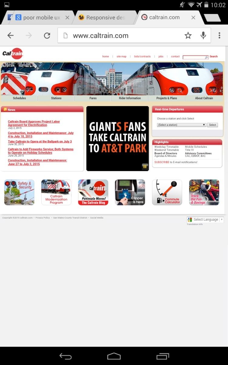
Some sites have a mobile option, but that option still has a desktop feel. I’m talking about things like miniscule link text and tiny tap targets. When trying to select something on the screen of a mobile device, fingers aren’t as precise as mouse pointers are on a desktop. It gets very annoying when every time you try to select something on screen, you end up in the wrong place. Even in my favorite feed reader, Feedly, it’s easy to accidentally save a link I meant to dismiss.
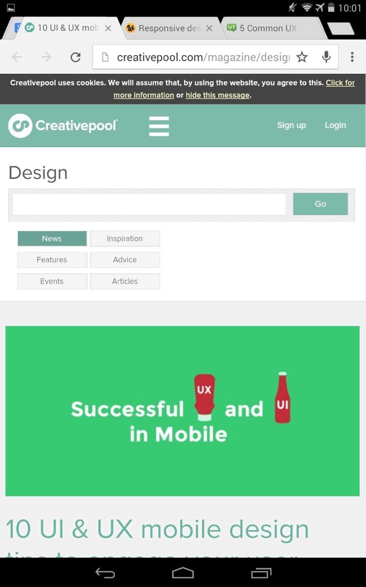
If people can’t get where they want on your site, the frustration they feel will drive them away. The example below has decent tap targets, but the graphic takes up too much space.

While we’re at it, let’s talk about that other popular design feature, the carousel or slider. I hate them and I’m not the only one. I can just about live with them on a desktop, but on mobile devices it means it takes far too long to get the information I need. If you’re using a carousel to showcase your products, check your analytics and see how your customers respond. Your best bet: avoid them and use large buttons instead.
3. Users Can’t Find What They Need
Over the years, we’ve been trained to type things into search boxes when we’re using computers to browse the web. That’s not always easy on mobile devices. Ecommerce sites may have thousands of pages, so navigation and search are always a challenge. People usually want to:
- find a product or product details
- research shipping and delivery information
- purchase an item
Your job is to make this as easy as possible for mobile device users. If people can’t find the information they need and it interrupts the flow, they have a poor customer experience and likely won’t buy.
Ways to fix this include making shipping and delivery obvious by building it into the page and helping users find items easily with autocomplete and mobile-friendly navigation options, such as buttons or collapsible, intuitive menus. Check out this article on Bruce Clay Inc for more on this.
4. Its Forms Suck
Can we talk about forms? I get it; I really do. You need to collect shipping and customer information but that long, complex form that works for PC users is totally wrong for mobile device users. Filling forms on tablets and forms often feels like torture. If your customers feel that way, they won’t bother.
What’s the alternative? Shorter forms that collect only the essential info or a click to call link. Social sign-on, if it is designed to work with the apps your customers already have on their devices. Or no form at all. The stats show that shorter forms convert better. Check out these examples for inspiration.
While we’re on the subject of forms, let’s talk about registration. As a retailer, you want to capture customer information, but trying to do it too soon can be a turnoff. Instead, prove that it’s worth them sticking around by providing all the info they need. I’ve always like the Asos site because when I first visited it, I could save and favorite items, and add them to my basket, then complete the minimum info needed to buy. There’s time enough to collect detailed info later.
If you have to sign up before you can get information, there’s no incentive, because there’s no proof you have anything I want.
5. The Checkout Isn’t Optimized
Mobile ecommerce represented around one fifth of all online holiday sales at the end of 2014, says Custora. Unless you want to lose these customers, you need to look after mobile checkout. We’ve already mentioned some aspects of this, like page speed, tap targets and not requiring registration. Smashing Magazine’s article on this has been around for awhile but still makes sense. It highlights areas like:
- distraction-free checkout pages
- progress bars
- security information
- guest checkouts
There are a couple of other areas to look at. Back on the subject of forms, putting field labels above form fields instead of in them means customers don’t have to wonder what information they are supposed to be entering. And using mobile device integrations so that users can fill out numbers with the number pad is also useful, says Formismo.

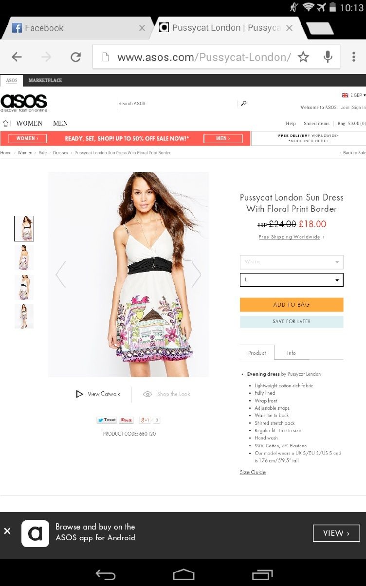
If you’re selling nationally or globally, letting your checkout detect the right locale so that customers see the right currency and shipping info is a must – Amazon does this even for desktop shoppers. And it’s also a good idea to use a persistent shopping cart and make the checkout/shopping basket easily visible and accessible. In the example above, Asos gets some things right, but the text is too much too small.
6. Misunderstanding Mobile User Behavior
With mobile devices it’s important to think about user behavior because mobile users are definitely not the same as PC users. Research shows that they make quick buying decisions, so forget about the lengthy copy that works for PC shoppers and make it easy for them to get the information they need ASAP. That’s the best way to make mobile UX work for them.
It’s been a multi-screen world for a while now. And that means customers may start a transaction on a smartphone and finish it on a tablet or desktop computer. That means you need a seamless experience and saved information to make the transition as smooth as possible for them. Check this out via analytics data which lets you track sessions by user ID.
The key rule of better conversions and sales is to give users what they want, so track, don’t guess. The latest mobile retail data says many customers are concerned about finding product details and security, both of which you can address as suggested in this article.
7. Other UI Issues
A good user interface (UI) doesn’t always translate to a good UX, but it helps. Look out for errors like:
- links that don’t work
- redirecting mobile users to desktop interfaces
- clutter on important conversion pages
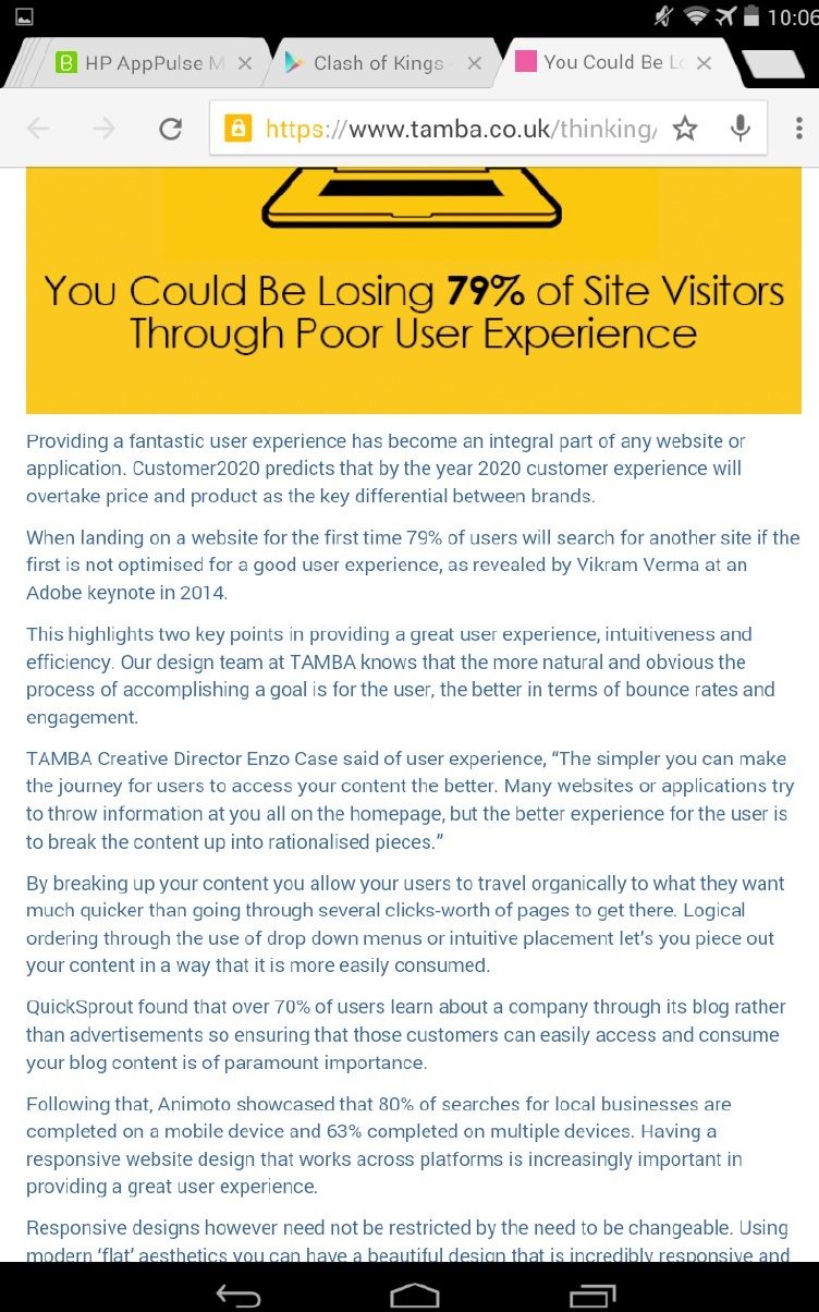
- text that’s hard to read (in the example below, some subheadings and a bigger font would be helpful).

Focus on the essentials to improve both UI and UX for your customers.
The bottom line?
Good UX will help potential customers trust your site and want to buy from you. So don’t get hung up on the perfect color scheme or pixel width for your content. Think about the overall experience and whether users will get what they need to complete a purchase. After all, that’s the mark of ecommerce success.
If you’re not sure whether your site is mobile-friendly, try it for yourself on a phone or tablet, use Google’s mobile-friendly testing tool or find a mobile emulator to see how it looks. Chances are if it doesn’t work for you, from landing to checkout, it won’t work for your customers either. Check out this list of 105 UX tips to see what you might need to fix first.


