Everyday people visit your store and leave because they could’t find what they wanted.
You need more than top rankings on Google. People have to be able to navigate to the product they want and trust you enough to buy. Your ecommerce UX (user experience) should focus on building your visitor’s confidence by helping them complete their goals.
According to Nielson Norman Group, a user experience research firm, there over 800 best practices for ecommerce usability. Unless you have billions of dollars to spend on development, you’re not going to meet every guideline. This post is filled with tips and examples so you can improve your ecommerce UX design and get more conversions.
Let’s break down basic best practices by page type. Check out this article for tips on mobile ux.
Home Page UX Tips That Build Trust On A Quick Glance
Your home page gets the most traffic. Make it obvious that you sell products. Think of your home page as the window to your store. Think Macy’s on Magnificent Mile. Dress your home page with your best products and images. One thing you never see at Macy’s is different dresses swooping by one by one in the window. I’m talking about sliders here. If you have to use them, make sure they are user friendly.
Hero Area Best Practices
Your hero area (also called featured area) is the most prominent real-estate on your home page. You only have 50 milliseconds to leave a good impression, here is how to make it count.
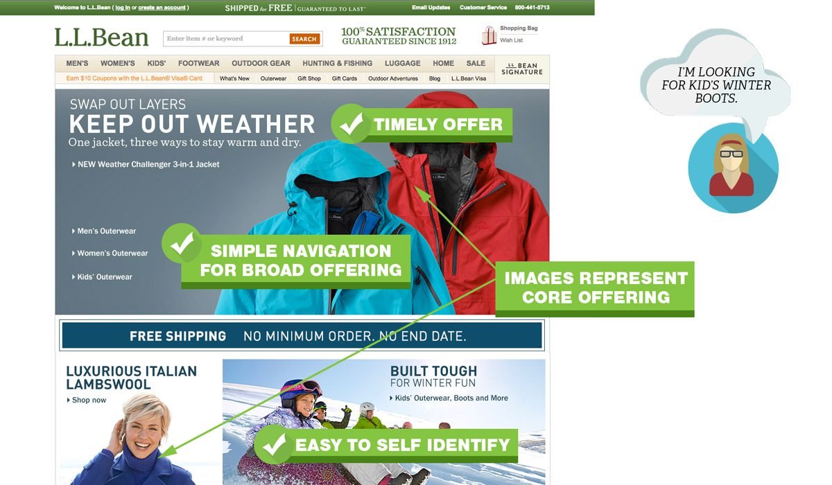
Hero Area Do’s
- Use simple, uncluttered design. Use as few words as possible.
- Eliminate everything that does not make an impact. For example, your recent blog posts.
- Use visual queues like color or arrows to focus attention on a single call to action.
- Make it easy for people to self identify. Do you sell pricy jackets for women?
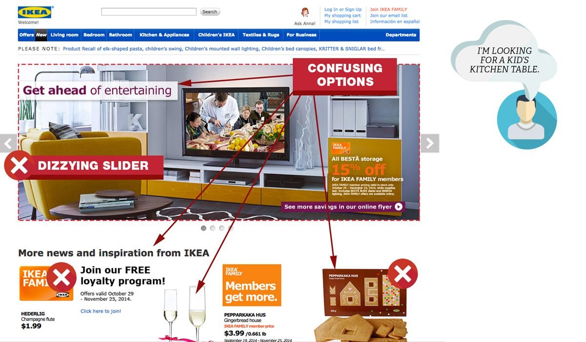
Hero Area Dont’s
- Decorate. Swirls, sparkles, and other meaningless symbols add to the cognitive load and distract your customers.
- Have outdated content like promotions from last week or even last month. You will instantly lose credibility.
- Clutter the area with too many messages or promotions.
- Have an automatically advancing slider or carousel.
- Emphasize a product that is not representative of your overall mix.
Home Page Navigation
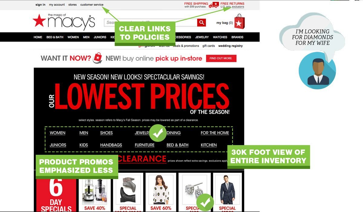
When people visit your site, you want to help them find what they came for. According to conversion expert, Tim Ash, the main focus of your home page is to provide category level navigation. Follow these pointers to help visitors find what they are looking for.
Home Page Navigation Do’s
- Give visitors a “30,000 foot view” of what your site sells so they can drill down to specific categories.
- Add your most used tools or buying guides.
- Provide links to return policy, customer service, shipping and privacy pages.
Home Page Navigation Dont’s
- Assume you know what people are looking for.
- Jam every category and subcategory on your home page.
- Push product level promotions. If you only have a few products, you can ignore this.
- Use generic stock photos. This screams inauthenticity.
Navigation: The Foundation of UX
Navigation is critical when you have a lot of categories, variable products or products with many options. Nothing is more frustrating than a cumbersome menu. The quicker people can find what they want, the quicker you can move them through to the checkout process.
The purpose of a navigation menu is to get people where they want to go. Here is a breakdown of what you should address:
Primary Navigation Menu Do’s
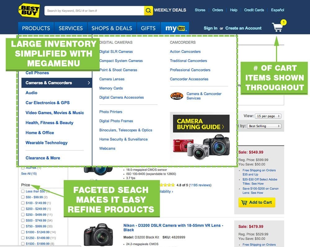
- Limit top menu to 7 choices.
- Use a secondary navigation at the top right for items like “Contact Us”
- Use a multi column menu that organizes categories and sub categories.
- Show high quality images of your product.
- Make your navigation menu prominent with contrasting colors.
- Cross reference products into multiple categories. Someone looking for a USB drive may look under Laptop, Accessories, Or Computers.
Primary Navigation Menu Dont’s
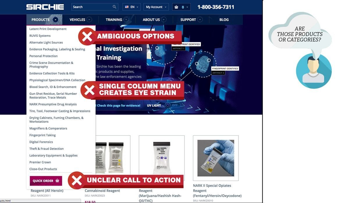
- Have a single drop down that takes up a long column.
- Show link empty category pages to main nav.
- Over-classify products. If there is only one product in a (sub)category, remove the category and reclassify the product.
- Don’t use vague options like “more.”
Shopping Cart Menus
A cart menu is likely the last button a user will click before taking out the credit card. Don’t over look this tiny icon.
Shopping Cart Menu Do’s
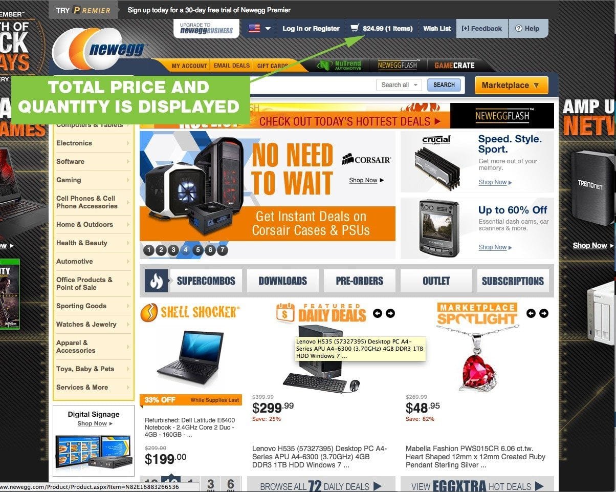
- Show total price and number of items in cart.
- Link to the cart page where they can see details of their contents
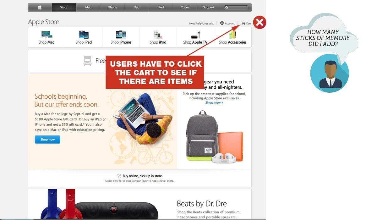
Shopping Cart Menu Dont’s
- Substitute a “mini cart” for a full cart. Your ecommerce site, needs a cart page, not just a cart widget.
- Link directly to a checkout page that doesn’t show every detail of the products in the shopping cart.
Search
Many users skip the navigation menu altogether and rely on search/faceted search to drill down further. Faceted search can get complicated quick. From a development and cost perspective, but also a user perspective. Follow these guidelines to keep things simple and helpful.
Search Do’s
- Use an open text field box at the top of every page.
- Use faceted search when there are over 20 products within a category.
- Filter by price, color, size are basic faceted search options.
Search Dont’s
- Use filler text on search input. Leave it blank, or say “Search.”
- Use subjective filtering options such as “heavy-duty” or “light-duty.”
Category Pages: Get Shoppers One Step Closer
Category pages can be a little tricky. You want to make sure the content isn’t too thin. Additional areas of text can work wonders with Google rankings, but too much text can confuse your customer.
Given the search query, “bathing suit” the result from Macy’s is highly relevant. It is easy for a user to further refine what they are looking for.
Keep Category Navigation Clutter Free
Be selective about what subcategories you present on your category page. Macy’s could have shown pictures of pink bathing suits, black bathing suits, one-piece, two-piece, etc. If every option was presented, shoppers would be paralyzed by the number of options. You also don’t want people to mistake your category page as a poor product listing page.
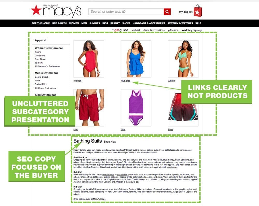
Category Navigation Do’s
- Use lots of white space and limited text.
- Describe subcategories in as few words as possible, but be specific.
- Use images to represent main subcategories appropriately.
- Use only text to represent less popular categories.
- Have a parent category if using a mega or drop down menu.
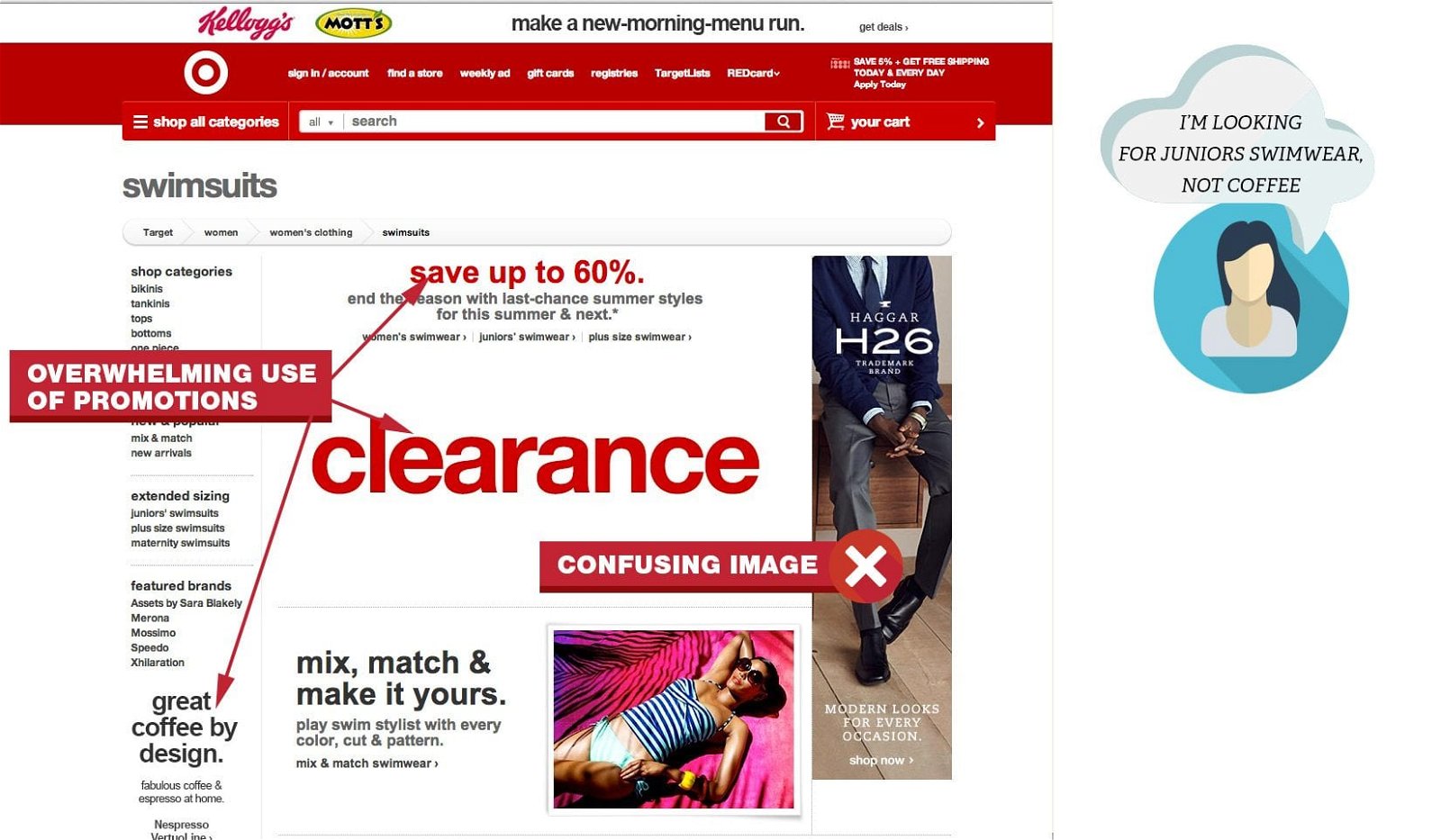
Category Navigation Dont’s
- Show irrelevant pictures.
- Rely only on text.
- Use multiple color text.
- Heavily push promos.
- Use product names for subcategories.
On Target’s website. you have to look really hard to find “juniors swimwear.”
Category Page Content
Category pages don’t need to be thin on content. Keyword research can help you understand shoppers’ burning questions. Use those keywords to address common questions about your product line.
Category Page Content Do’s
- Focus on your buyer’s needs.
- Use semantic keywords to supplement your main keyword.
- Address FAQs related to the category.
Category Content Dont’s
- Put large blocks of copy at the top of the page.
- Use your primary keyword over and over.
- Use irrelevant images. Can you believe the photo of a man’s suit on Target’s bathing suit page?
- Put text in images.
Product Listings Pages: Inform and Build Confidence
I’m shocked at how many product listing pages are thin on content. Best Buy’s content rich, user friendly product listing pages consistently rank high. Their page illustrates many best practices.Best Buy’s product listing page makes it possible to convert without even visiting the product page. Ecommerce product listings pages must give essential product information such as: image, price, options and availability. Let these pages do some selling for you.
SEO Content For Product Listing Pages
User friendly copy will naturally be SEO friendly. You want people (and Google) to clearly understand the contents of your page. You also want to gently navigate people away from this page if they don’t see what they want.
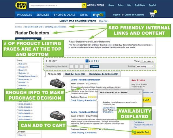
SEO Content Do’s
- Use the most relevant, lowest difficulty keywords in your page title and h1 tag. Read more about keyword research.
- Use additional keywords in a short summary of the category.
- If additional information is needed, put it below the product listings.
- Use breadcrumbs to help users navigate and distribute PageRank to your category pages.
- Show pricing and options.
- Provide a product overview, if there is an add to cart button.
SEO Content Dont’s
- Stuff too much content before products are listed.
- Use cutesy or figurative names for products. If you are selling kids’ shoes, don’t call brown sandals “George.”
Product Listings Navigation
Once a user has an idea what they want to buy, they will shop your product listings page. Make it clear that they have multiple options and pages to shop on. You want them to keep looking if they don’t see what they want on the first page.
Product Listings Page Navigation Do’s
- Show the number of pages before and after the product listings.
- Show the total number of products within that category.
- Allow users to sort by: price,
- Allow users to jump to specific pages within the results.
Product Listings Page Navigation Dont’s
- Make users click arrows to change pages.
- Assume people will scroll back up to the top or click the “View All” button.
- Use tiny or blurry product photos.
Product Pages: Where SEO, UX and Sales Meet
Full product details are critical. For SEO and user experience. Internal links boost SEO and help the user navigate back to the product listings page. A user-friendly product page design will have essential product information above the fold.
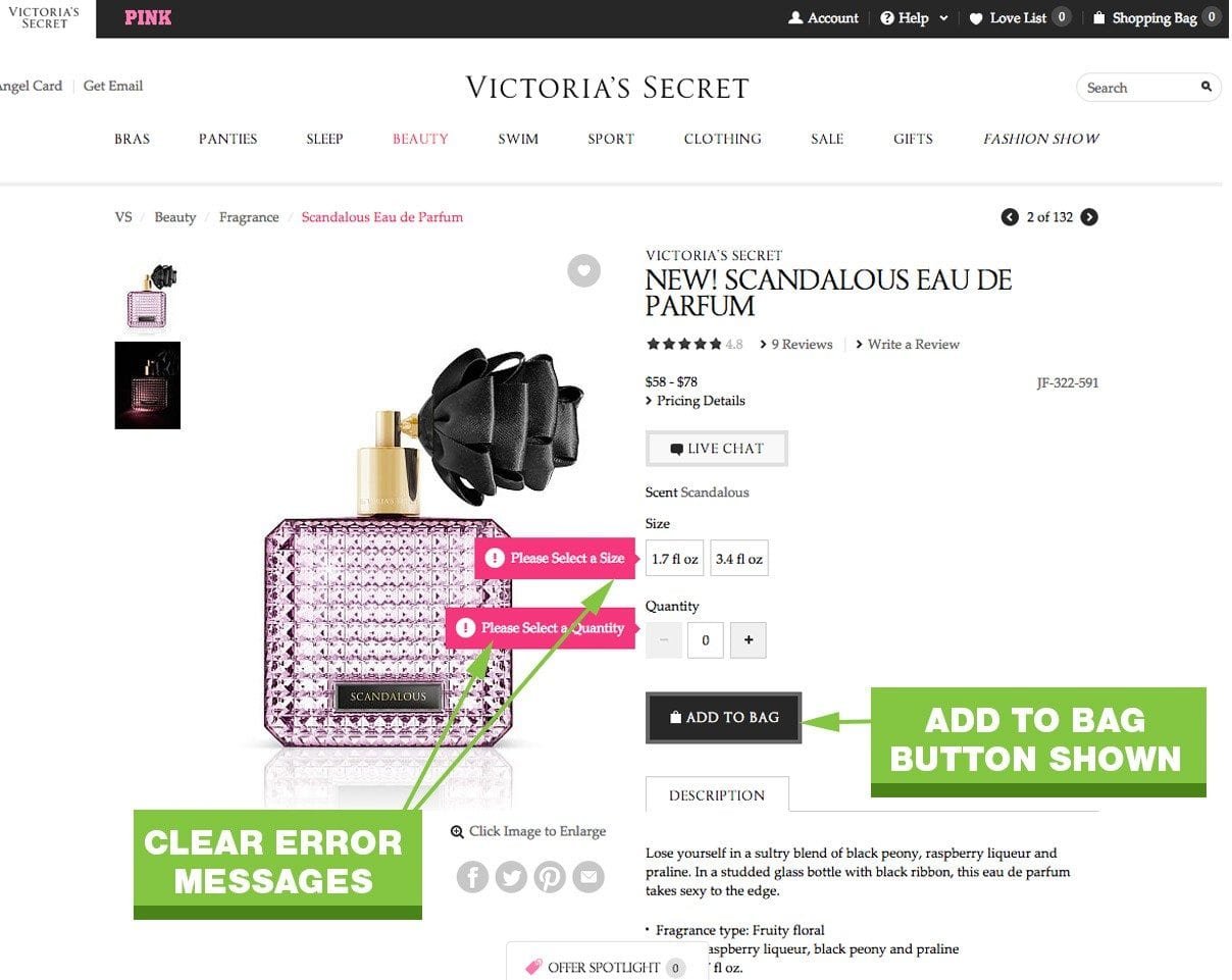
Product pages are the meat of your site, they need to be persuasive. If your customer has to select an option before adding to cart, display an error message when the “Add to Cart” button is clicked.
Product Page Content Layering
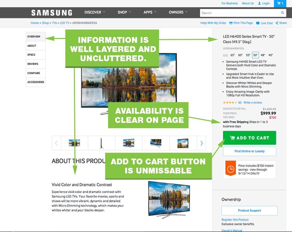
Your product page can quickly suffer from information overload. You want the right level of product information for people that already know what they want to buy, but also cater to shoppers that need every last product detail. By layering your information, you can cater to both types of buyers.
Product Page Content Layering Do’s
- Provide a short product summary at the top of the page or next to the photo.
- Add a border or shaded background to your “action area” – where people select options and click your button.
- Present the ordering options near the top in the action area
- Have breadcrumbs on the product pages.
- Put product details, reviews, data, etc. below the product image and CTA area.
Product Page Content Layering Dont’s
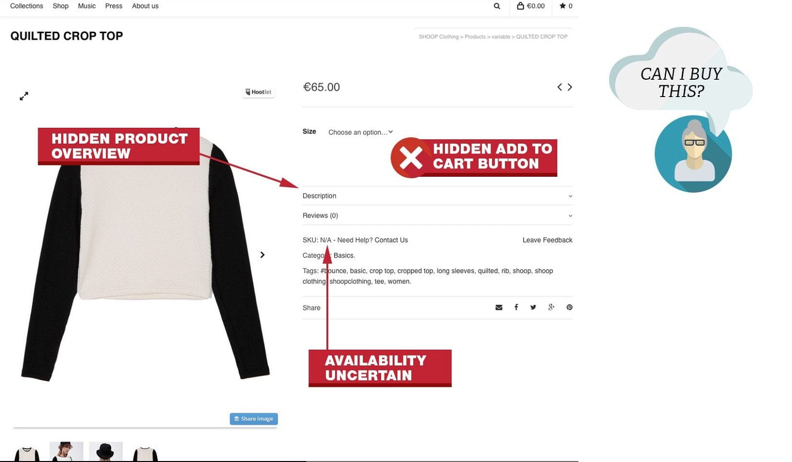
- Put a large block of copy near or above the CTA button.
- Hide your add to cart button until someone makes a selection.
- Make availability information an extra click away.
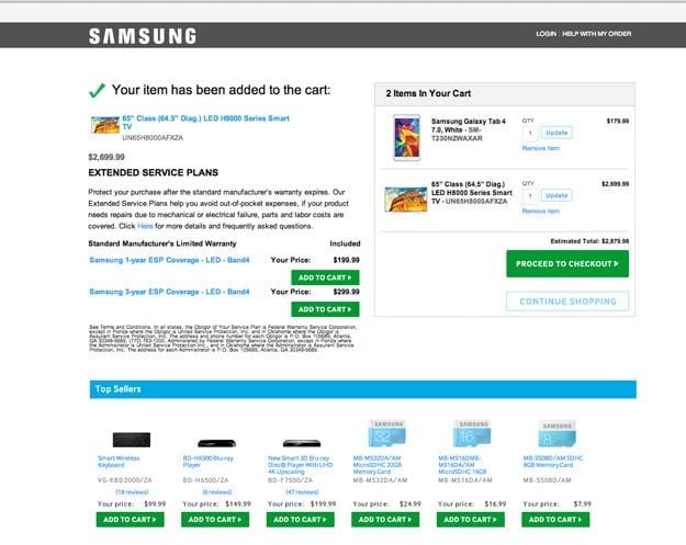
- Have a subtle change when someone clicks your add to cart button. People will miss your “Successfully added” message.
A common mistake I saw with many WordPress ecommerce themes was hidden “Add To Cart” buttons.
Product Page Images
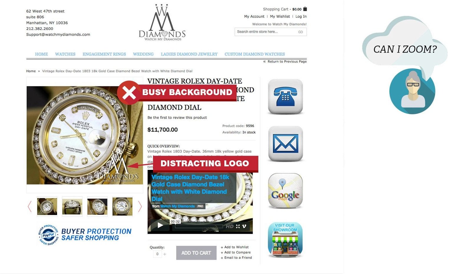
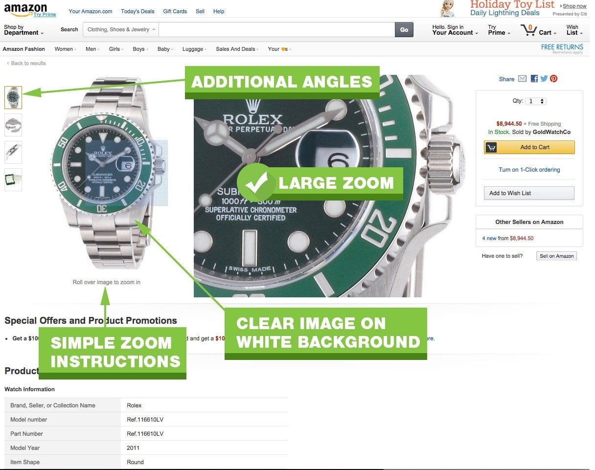
Large photos and zoom is about the closest your buyer can get without physically touching the product. Fuzzy, poor quality images make the products look poor quality too. Check out this case study, where bigger, better product images increased conversions by over 300%.
Product Page Images Do’s
- Use large, high res photos on a white background.
- Use zoom features to let users see details for themselves.
- Allow users to scroll to back and forth between images.
- Provide clear instructions that additional images or zoom features are enabled.
Product Page Images Dont’s
- Show “lifestyle” images or your product. Show just the product.
- Don’t muddy up your photos with logos, watermarks or backgrounds.
- Force an image pop-up to see more details or additional photos.
Checkout Process: Built For Trust
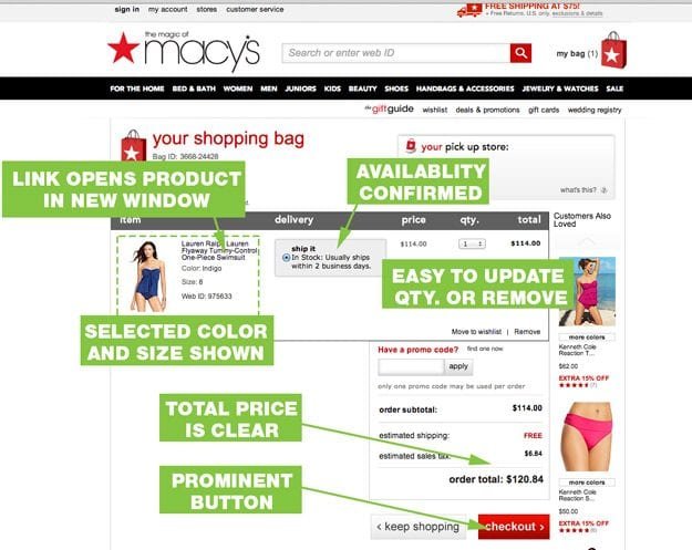
Your checkout process needs to be simple, logical and distraction free. Don’t complicate it. Macy’s cart page hits many of the main points. The cart shows product details with images, pricing, tax and links back to individual product pages.
Shopping Cart Page
The first page in your checkout process is your cart page. This page reaffirms what they have intent to purchase in detail. This helps them build confidence and trust in your store. A well designed cart age will help you reduce cart abandonment.
Shopping Cart Page Do’s
- Confirm everything. Product, size, color, quantity, availability, ship date, estimated delivery.
- Allow users to navigate directly back to products in their cart.
- Make it easy to change quantity or delete products. Let users change qty to 0 to remove products or click a “remove” button.
- Show a picture of the product, in the color it was ordered in. If your customer orders a black jacket and sees a blue one at checkout, they lose confidence.
- Make the continue checkout button prominent, but allow people to continue shopping.
- Show the total out the door price.
Sopping Cart Page Presentation Dont’s
- Prematurely ask for a credit card or email address. Let people confirm what they are buying.
- Don’t use an “Update” button to remove products.
Registration Page
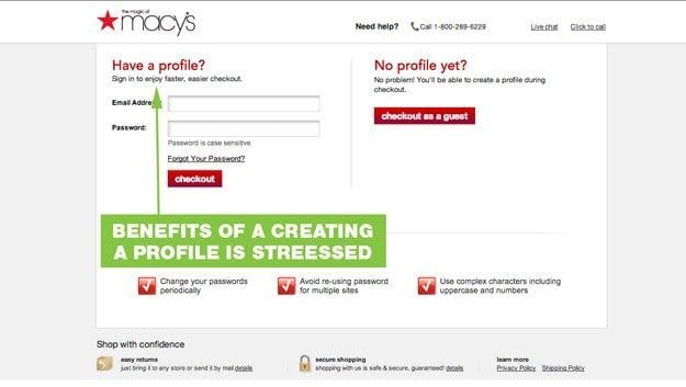
This is the pivotal moment that you have to get information from your visitor. Let buyers checkout without creating an account. Customers are not forced to create and remember a new login and password, but the benefit of creating an account is stressed. Note the simple layout of the page. The simple choice reduces cognitive load.
Registration Page Do’s
- Stress the benefits of creating an account.
- Use a simple layout.
- Don’t ask more than 2 questions.
Registration Page Dont’s
- Force people to create an account. No one wants to remember a new username and password.
- Prematurely ask for a credit card or email address. Let people confirm what they are buying.
- Don’t use an “Update” button to remove products.
Checkout Page
After buyers feel confident that they are ordering the right product from the right company (yours), it is time to get the party started.
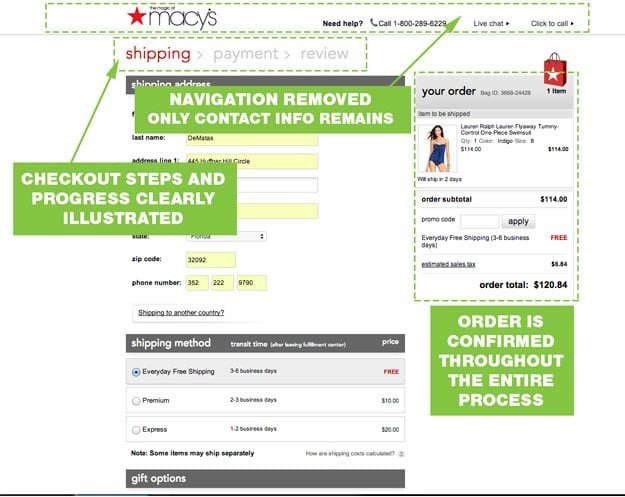
Once users start the check out process, they want to complete the purchase as quick as possible. Help them help you. Remove distractions and make the process as easy as possible. Don’t make them re-enter their address or guess how to complete the form.
Checkout Page Do’s
- Ask for only the minimal required information.
- Replace the main navigation with a “contact” navigation.
- Keep your checkout process short and your steps clear and logical.
- Show progress during the checkout process.
- Let users use billing address as shipping address with a single click.
Checkout Page Dont’s
- Present new information or choices.
- Force people to “join” or “become a member.”
- Make people reenter the same information twice.
How Does Your Site Stack Up?
You don’t have to have a million dollars to create a positive shopping experience. None of the big brands above meet the 800+ guidelines suggested by Nielson Norman Group. Don’t assume your customers know your site like you do. Nail these basics and you will get Google and customers to love your site and buy from you.
